
Whether you’re presenting a research project, a group assignment, or a class pitch, the way you design your slides can make the difference between a memorable performance and a forgettable one. For students, mastering presentation design not only improves grades but also builds confidence for future professional settings. In this guide, we’ll explore practical strategies, visual principles, and free tools that empower you to create compelling, student‑friendly presentations that stand out.
Understanding Your Audience

Before you open any design software, take a moment to consider who will be watching your presentation. Are you speaking to peers, a professor, or a mixed audience? Knowing their expectations helps you choose the appropriate tone, level of detail, and visual complexity. For instance, a technical audience may appreciate data‑heavy slides, while a general class might respond better to clear visuals and concise explanations.
Gathering this insight can be as simple as reviewing the assignment brief or asking classmates about their preferences. Tailoring your content to the audience’s knowledge base ensures that your message resonates, reduces confusion, and keeps attention focused throughout the talk.
Choosing the Right Color Palette

Color isn’t just decorative; it guides perception and emotion. For student presentations, opt for a limited palette—typically two to three complementary colors—to maintain visual harmony and avoid overwhelming viewers. Soft blues and greens convey calm and trust, while a splash of orange can highlight key points without being distracting.
Test your palette by printing a slide in grayscale; if the contrast still stands out, you’ve chosen effective colors. Remember to consider accessibility: ensure sufficient contrast for viewers with visual impairments by using tools like the WebAIM contrast checker.
Crafting Clear Slides

Clarity is king when it comes to slide design. Start each slide with a single, focused idea and support it with concise bullet points—ideally no more than six words per bullet. Avoid dense paragraphs; instead, use short phrases that you can elaborate on verbally.
White space is your ally. By leaving margins around text and images, you give the audience’s eyes room to rest and process information. This minimalist approach not only looks professional but also reduces cognitive load, helping listeners retain more of your message.
Using Visuals Effectively

Images, charts, and icons can transform abstract concepts into understandable ideas. Choose visuals that directly support your point—avoid decorative graphics that add no value. For data, simple bar or line charts are often clearer than complex infographics.
When selecting photos, prefer high‑resolution, real‑world scenes that relate to your topic. A well‑placed photograph of a lab experiment, for example, can illustrate a scientific method more powerfully than text alone.
Typography Basics for Students
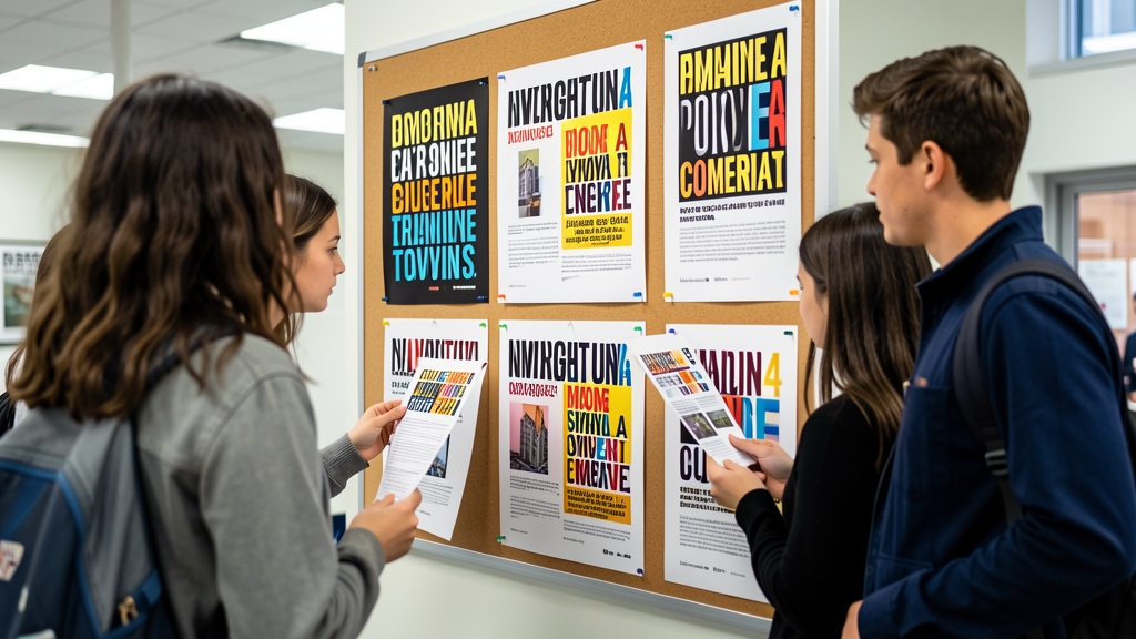
Fonts convey personality and readability. Stick to one or two typefaces: a sans‑serif for headings (like Helvetica or Arial) and a complementary serif or sans‑serif for body text. Keep font sizes large enough—at least 24 pt for headings and 18 pt for body—to be legible from the back of the room.
Avoid all‑caps sentences and excessive italics, which can hinder readability. Consistent line spacing (1.2–1.5) and left‑aligned text also help maintain a clean, professional appearance.
Structuring Your Narrative

A well‑structured narrative guides your audience through a logical flow: introduction, problem statement, methodology, results, and conclusion. Use slide titles as signposts, summarizing each section’s purpose in a few words.
Transition slides—simple slides with a single word like “Methodology” or an icon—signal shifts in topic and give listeners a moment to reset. This scaffolding keeps the presentation organized and makes it easier for the audience to follow your argument.
Practicing Delivery and Timing
Design is only half the battle; delivery brings it to life. Rehearse your slides aloud, timing each segment to stay within the allotted period. Aim for a steady pace—roughly one slide per minute for a 10‑minute talk.
Record yourself or practice in front of peers to receive feedback on pacing, tone, and body language. Adjust slide content if you consistently run over time; concise slides make it easier to stay on schedule while preserving key messages.
Leveraging Free Design Tools
Students often work with limited budgets, but many powerful, free design platforms exist. Tools like Canva, Google Slides, and DesignStager offer templates, color palettes, and drag‑and‑drop interfaces that simplify slide creation without sacrificing quality.
Explore each tool’s library of free icons and images, and take advantage of collaborative features to co‑edit with teammates in real time. By mastering these resources, you can produce polished presentations without spending a dime.
Effective presentation design is a blend of visual clarity, audience awareness, and confident delivery—skills that serve students well beyond the classroom. Start applying these tips today, experiment with DesignStager’s AI‑powered templates, and watch your grades and confidence soar. Ready to transform your next slide deck? Sign up for a free trial at DesignStager and unleash your creative potential.