
Freelancers live by the power of a great pitch. Whether you’re selling a branding package, a development project, or a consulting service, a polished presentation can turn a hesitant prospect into a long‑term client. Yet many freelancers treat slide decks like an afterthought, missing opportunities to showcase professionalism and creativity. This guide reveals practical, design‑focused tips that help you craft compelling decks without spending weeks in a design studio.
Know Your Audience and Purpose

Before you open a design tool, spend time researching who will sit in the chair across from you. Are they a tech‑savvy startup founder, a corporate marketing director, or a nonprofit board? Understanding their priorities, visual preferences, and decision‑making style informs everything from color choices to the amount of data you display.
Define a clear purpose for each slide. A slide that tries to do too many things—inform, persuade, and entertain—ends up confusing the viewer. Write a one‑sentence goal for every slide, then design around that single objective, keeping the narrative tight and focused.
Align your visual language with the audience’s expectations. A minimalist, monochrome deck works well for a finance executive, while a vibrant, image‑rich layout may resonate better with a creative agency. Matching tone to audience builds trust before you even speak.
Craft a Cohesive Visual Brand

Your personal brand is an extension of your freelance business. Use the same logo, color palette, and typography across all client‑facing materials, including your presentation. Consistency signals reliability and helps prospects remember you after the meeting ends.
Select a primary color that reflects your niche—cool blues for tech, warm oranges for hospitality, or bold greens for sustainability. Limit secondary colors to two or three complementary shades to avoid visual clutter. Apply these colors consistently to headings, accents, and data visualisations.
Design a simple slide template that incorporates your logo in a non‑intrusive corner and reserves ample white space for content. A well‑structured template reduces the time you spend on each new deck while reinforcing your brand identity with every slide you share.
Simplify Slides with Clear Hierarchy

Visual hierarchy guides the viewer’s eye to the most important information first. Use size, weight, and placement to establish a clear order—large bold headings, medium sub‑headings, and smaller body text. This structure makes it easy for busy decision‑makers to scan and retain key points.
Limit the amount of text on each slide. Aim for no more than six lines of copy, each line under 12 words. Replace dense paragraphs with concise bullet points, icons, or short statements that capture the essence of your message.
Employ whitespace strategically. Empty space isn’t wasted; it creates breathing room that enhances readability and reduces cognitive overload. A clean slide feels professional and allows your audience to focus on the message rather than decorative noise.
Use Storytelling to Drive Engagement

People remember stories better than statistics. Frame your presentation as a narrative arc: set the stage with the client’s challenge, introduce your solution as the hero, and conclude with measurable results. This structure keeps listeners emotionally invested from start to finish.
Incorporate relatable anecdotes or case studies that illustrate how you solved similar problems. Real‑world examples add credibility and make abstract concepts tangible, helping prospects envision the value you can deliver.
End each section with a clear takeaway or question that prompts interaction. Engaging your audience through questions not only reinforces key points but also creates a dialogue, turning a monologue into a collaborative discussion.
Incorporate High‑Quality Imagery and Icons

Visuals speak louder than words, especially for freelancers who need to showcase creativity quickly. Choose high‑resolution photos that reflect the context of your pitch—people collaborating, products in use, or environments that match the client’s industry.
Use a consistent icon style to represent concepts like growth, efficiency, or innovation. Icons should be simple, recognizable, and aligned with your color palette. Avoid overloading slides with decorative images that don’t add informational value.
When possible, customize images with subtle overlays or brand colours to maintain visual cohesion. A well‑chosen photograph paired with a concise caption can replace an entire paragraph, making your deck more digestible and memorable.
Polish with Consistent Typography and Color
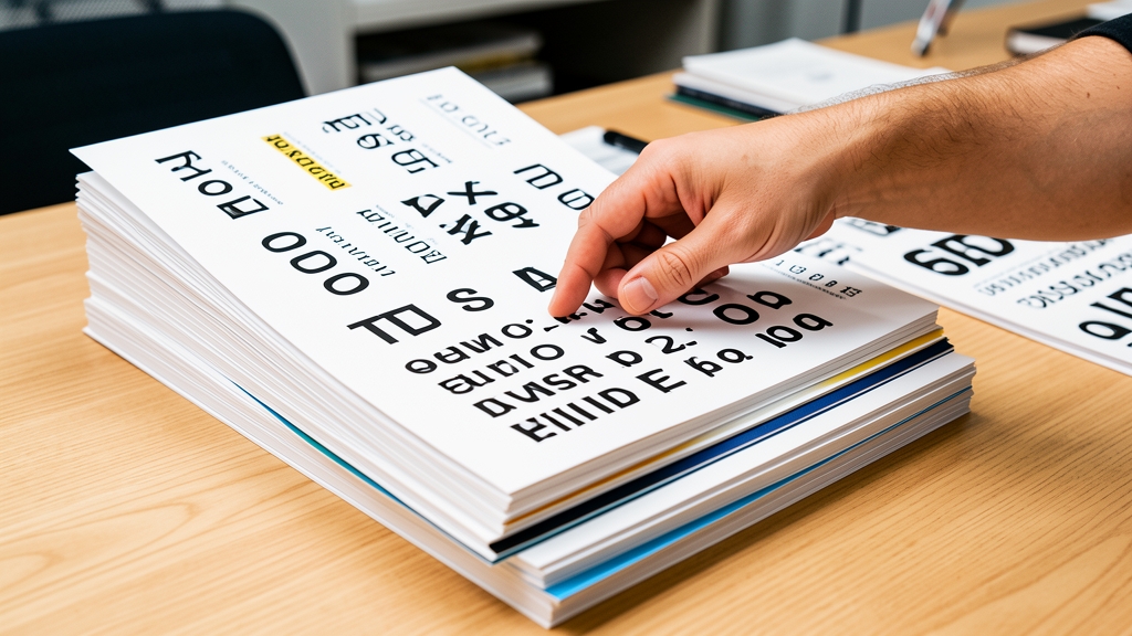
Typography is a silent communicator. Limit yourself to two typefaces—one for headings and one for body copy—to keep the design unified. Choose fonts that are legible at a distance; sans‑serif fonts like Helvetica or Open Sans work well for presentations.
Establish a hierarchy of font sizes: large for titles, medium for sub‑headings, and smaller for body text. Consistent line spacing and alignment further enhance readability. Avoid all‑caps for body copy; it reduces legibility and can feel shouty.
Apply your color palette consistently across headings, bullet points, and data visualisations. Use contrast wisely—dark text on a light background is easiest to read. A final visual audit of each slide ensures that fonts, colors, and spacing are harmonious before you export the deck.
Mastering presentation design empowers freelancers to win more projects, command higher rates, and showcase professionalism with every pitch. By understanding your audience, building a cohesive brand, simplifying content, telling a compelling story, using strong visuals, and polishing typography, you create decks that leave a lasting impression. Ready to elevate your presentations? Try DesignStager’s AI‑powered templates and streamline your design workflow today.