
Ever opened PowerPoint and felt overwhelmed by the endless design options? You’re not alone. Beginners often struggle to turn raw ideas into slides that look polished and keep viewers engaged. This guide breaks down the most effective PowerPoint design tips for beginners, giving you a clear roadmap to create presentations that stand out without the guesswork.
Start with a Clear Purpose

Before you choose a font or color, define the purpose of each slide. Ask yourself what you want the audience to remember after the presentation ends. A clear purpose guides every design decision, ensuring that each element serves a specific communication goal rather than becoming decorative fluff.
Map out a simple story arc—introduction, key points, and conclusion—and assign a purpose to every slide within that flow. When each slide has a single, focused objective, the overall presentation feels cohesive and the audience stays on track.
Choose a Consistent Color Palette

A harmonious color palette creates visual unity and reinforces your brand or theme. Start with one primary color that reflects the tone of your message, then add two to three complementary shades for accents. Use tools like color wheels or online palette generators to find balanced combinations that work well together.
Apply your palette consistently: background, headings, and key graphics should share the same hues. Consistency reduces visual noise, makes the slides easier to read, and helps the audience retain information longer.
Select Readable Fonts and Sizes
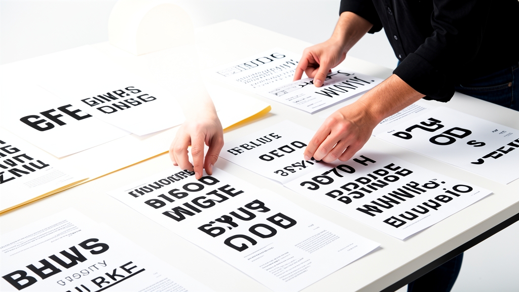
Typography is the backbone of slide readability. Stick to one or two clean, sans‑serif fonts—one for headings and another for body text. Fonts like Arial, Calibri, or Helvetica render clearly on projectors and screens of all sizes.
Maintain a hierarchy by using larger sizes for titles (30‑36 pt) and slightly smaller sizes for bullet points (24‑28 pt). Avoid all‑caps for body copy and keep line spacing generous to prevent crowding. Consistent, legible fonts keep your audience focused on content, not on deciphering text.
Use Visual Hierarchy Effectively

Visual hierarchy guides the viewer’s eye to the most important information first. Use size, color, and placement to differentiate headings, sub‑headings, and supporting details. For example, bold a key statistic and place it in the center of the slide to draw immediate attention.
White space is a powerful tool—don’t feel compelled to fill every inch of the slide. Strategic gaps create breathing room, making the content appear organized and easier to scan. A well‑structured hierarchy turns complex data into digestible insights.
Incorporate High‑Quality Images

Images can convey ideas faster than words, but only if they are sharp, relevant, and properly placed. Choose photos with high resolution (300 dpi for print, 72 dpi for screen) and avoid pixelation. Align images with the slide’s focal point to reinforce the message rather than distract.
When selecting visuals, prioritize authenticity—real people, genuine settings, and natural lighting resonate more with audiences than generic stock photos. Crop and position images to create balance, and use subtle overlays if you need to improve text readability.
Simplify Data with Smart Charts

Charts are essential for illustrating trends, but they can quickly become confusing. Limit each chart to one main takeaway and reduce clutter by removing unnecessary gridlines, legends, and 3‑D effects. Use contrasting colors to highlight the primary data series.
Label axes clearly, add concise titles, and consider using data callouts for key points. When possible, replace dense tables with simple bar or line charts that tell a story at a glance. Clear, streamlined visuals help the audience grasp complex information instantly.
Add Subtle Animations and Transitions
Animations can enhance storytelling when used sparingly. Choose subtle entrance effects—like fade or wipe—to introduce new points without startling the audience. Consistency is key: apply the same transition style throughout the deck to maintain a professional feel.
Avoid flashy animations, auto‑play videos, or excessive motion that diverts attention from the core message. Simple, purposeful motion can emphasize a point, but overuse creates fatigue and diminishes impact.
Proofread and Test Your Slides
Even the most beautifully designed slides lose credibility if they contain typos or formatting errors. Conduct a thorough proofread, checking for spelling, grammar, and consistent punctuation. Read the presentation aloud to catch awkward phrasing.
Finally, test your deck on the actual equipment you’ll use—projector, laptop, or conference room screen. Verify that colors appear as intended, fonts render correctly, and animations run smoothly. A polished, error‑free presentation reflects professionalism and boosts confidence.
Mastering these PowerPoint design tips for beginners equips you to craft presentations that capture attention and deliver your message with clarity. Ready to take your slides to the next level? Try DesignStager’s AI‑powered templates and let the platform handle the heavy lifting while you focus on storytelling.