
Whether you’re rewarding employees, honoring graduates, or celebrating milestones, a well‑crafted certificate speaks volumes about the value you place on achievement. In this guide we’ll walk you through every design decision—from layout to security features—so you can produce professional certificates that look polished and feel authentic.
Understanding the Purpose of a Certificate

A certificate is more than a piece of paper; it’s a tangible acknowledgment of accomplishment that can boost morale, reinforce brand values, and become a keepsake. Clarifying the purpose—whether it’s for employee recognition, academic graduation, or event participation—helps you decide the tone, formality, and visual language of the design.
Start by asking who will receive the certificate and what emotion you want to evoke. A corporate award may call for a sleek, minimalist style, while a community award might benefit from warm colors and decorative flourishes that reflect local culture.
Choosing the Right Layout and Size
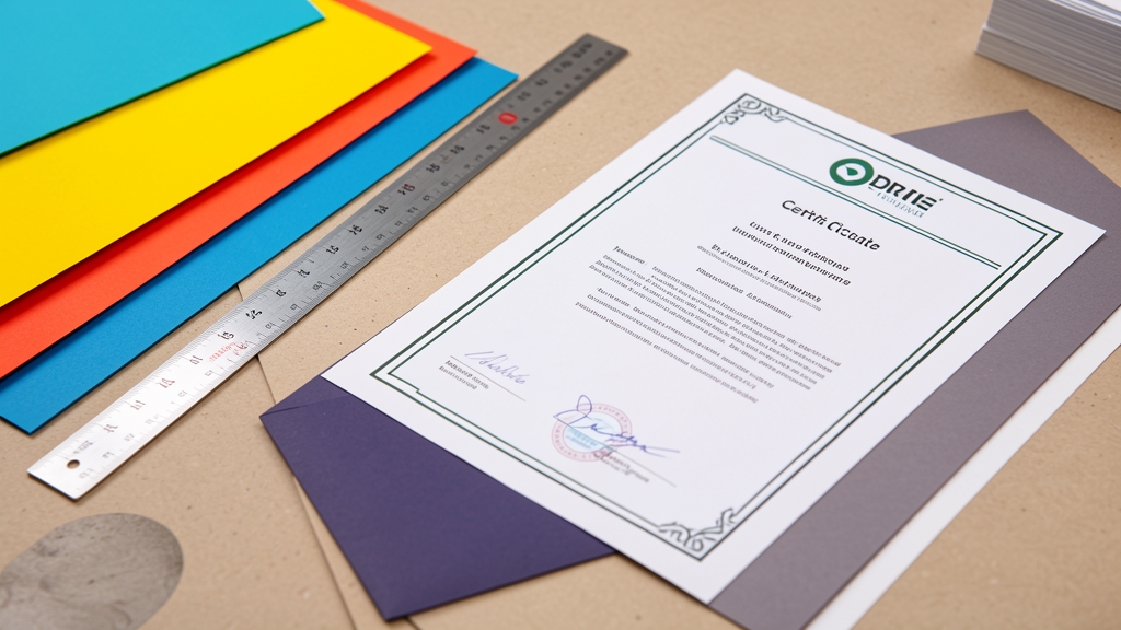
The layout sets the hierarchy of information. Traditional certificates often use a centered composition with ample white space, while modern designs might opt for a left‑aligned grid that highlights key details. Decide early whether you’ll include borders, watermarks, or background patterns, as these choices affect readability.
Standard sizes such as 8.5×11 in (letter) or A4 are printer‑friendly, but larger formats like 11×14 in can add a sense of prestige. Keep in mind the final printing method; some printers require bleed margins, so design slightly larger than the final cut size.
Selecting Fonts and Typography
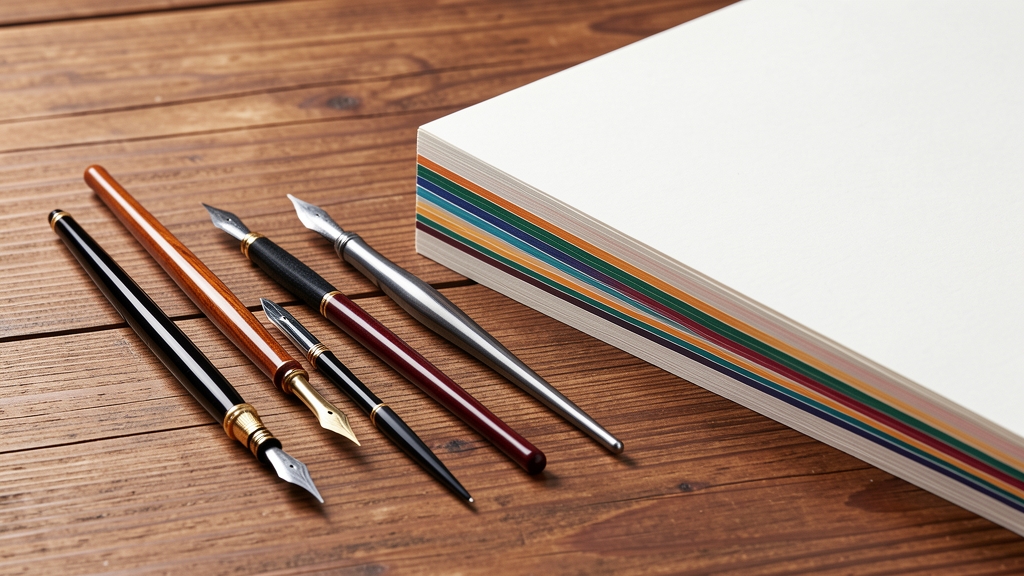
Typography conveys the certificate’s tone. Pair a classic serif for the main heading—think Times New Roman or Garamond—with a clean sans‑serif for body text to ensure legibility. Limit the design to two or three typefaces to maintain visual cohesion.
Use hierarchy deliberately: the recipient’s name should be the most prominent element, followed by the award title, issuing organization, and date. Adjust tracking and leading for balance, and avoid overly decorative fonts that can hinder readability when printed.
Incorporating Branding Elements
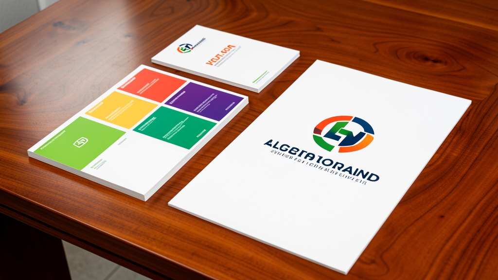
Consistent branding reinforces credibility. Include your logo, official colors, and any taglines in a subtle manner—typically in a corner or as a faint watermark. If your brand guidelines specify a particular shade, use the exact Pantone or HEX value to ensure color accuracy in print.
When adding logos, maintain clear space around them to prevent crowding. Consider using a vector version of the logo to avoid pixelation, especially if the certificate will be printed at high resolution.
Adding Security Features and QR Codes

To prevent forgery, incorporate subtle security elements such as embossed seals, holographic foils, or micro‑text. These features are often applied during the printing process and add a layer of authenticity without distracting from the design.
Modern certificates can also include a QR code that links to a verification page or digital version of the award. Place the code in a discreet corner, ensuring it’s scannable but doesn’t dominate the visual hierarchy.
Finalizing and Exporting for Print
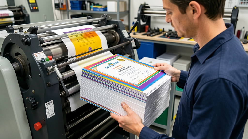
Before sending to print, double‑check all spellings, alignment, and color settings. Convert text to outlines to avoid font substitution issues, and embed all images at 300 dpi or higher. Export the file as a PDF/X‑1a for reliable color management.
Order a proof copy to evaluate paper weight, ink saturation, and any security features. Once satisfied, you can produce the full batch, confident that each certificate reflects the professionalism and care your organization stands for.
Creating professional certificates is a blend of thoughtful design, brand consistency, and practical printing considerations. With these steps, you’ll be able to craft awards that not only look impressive but also stand the test of time. Ready to design your next certificate? Try DesignStager’s AI‑powered templates and bring your vision to life in minutes.