
In a world saturated with digital ads, a well‑crafted flyer can still cut through the noise and deliver a powerful, tangible message that resonates with potential customers. Whether you’re promoting a grand opening, a seasonal sale, or a new service, mastering the art of flyer design is essential for businesses that want to stand out and drive real results.
Understand Your Audience and Goal
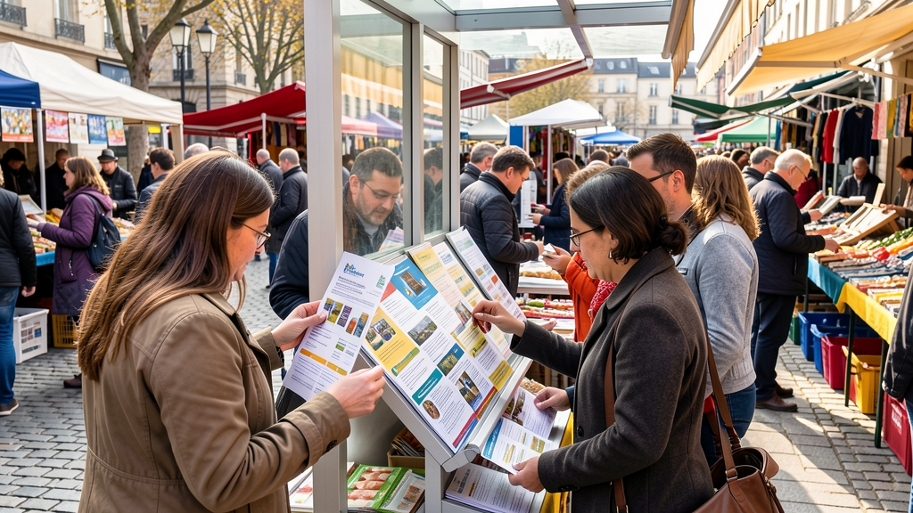
Before you pick a color or font, clarify who you’re speaking to and what you want them to do. Are you targeting young professionals for a tech workshop, or families for a community fair? Defining the audience shapes every design decision, from imagery to language, ensuring the flyer feels relevant and compelling.
Equally important is the flyer’s primary objective—whether it’s generating leads, driving foot traffic, or building brand awareness. A clear goal helps you prioritize information, keeping the message focused and the call‑to‑action unmistakable.
Keep the Layout Clean and Focused
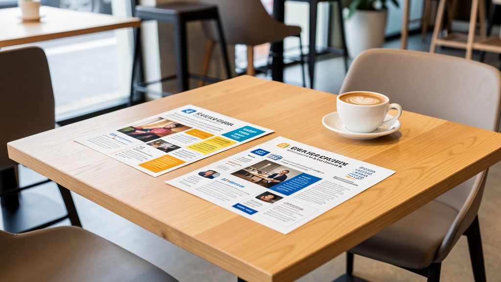
A cluttered flyer overwhelms readers and dilutes your core message. Use a grid system to align elements, create visual hierarchy, and give the eye natural pathways. White space isn’t empty—it’s a design tool that highlights key details and improves readability.
Limit the number of sections to three or four main blocks: headline, visual, copy, and call‑to‑action. This streamlined approach guides the viewer quickly to the most important information without unnecessary distractions.
Choose Eye‑Catching Colors Wisely
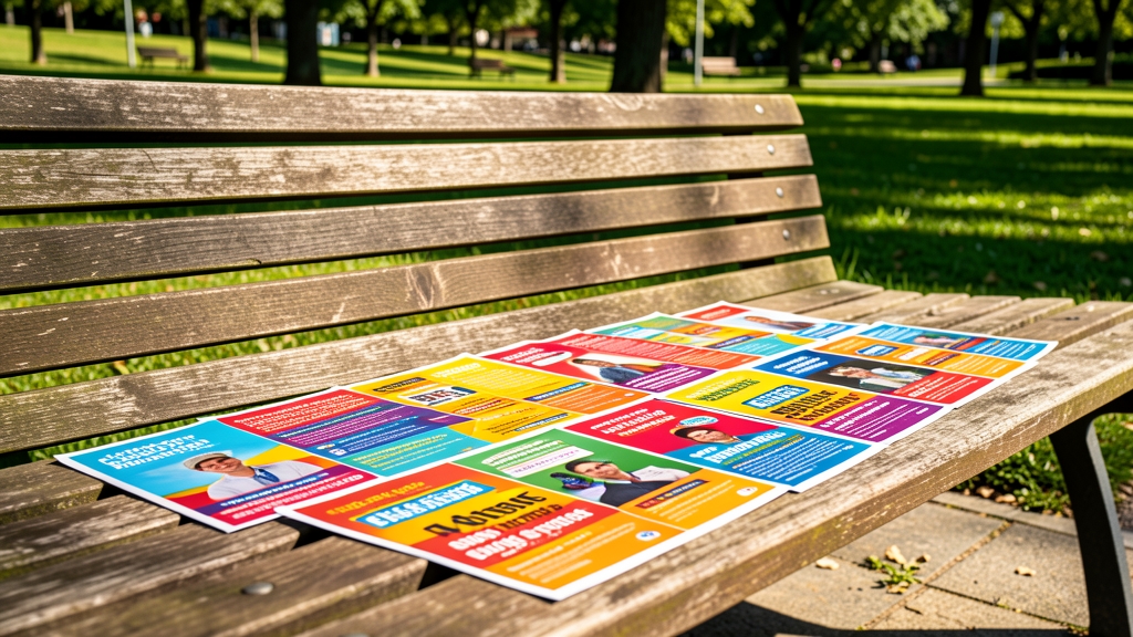
Color evokes emotion and can instantly convey your brand’s personality. Choose a palette that aligns with your brand identity while also standing out against competitors. High‑contrast combinations, like deep navy with bright orange, draw attention without sacrificing elegance.
Remember the psychology of color: blues suggest trust, reds spark urgency, and greens convey growth. Use one dominant color, a secondary accent, and a neutral background to maintain balance and avoid visual overload.
Use Strong, Readable Typography
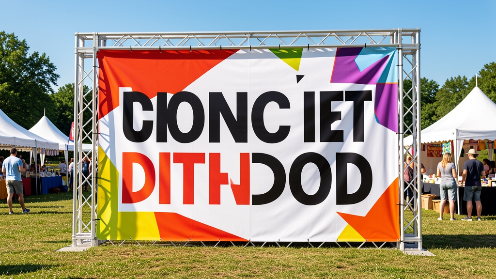
Typography is the voice of your flyer. Select fonts that reflect your brand tone—bold sans‑serifs for modern, energetic vibes, or classic serifs for a refined, trustworthy feel. Limit yourself to two typefaces: one for headings and another for body copy.
Ensure legibility by maintaining sufficient font size and line spacing, especially for crucial details like dates and addresses. Contrast the text color against the background to avoid strain and keep the message clear at a glance.
Incorporate Compelling Images and Graphics

Images are the visual hook that draws eyes to your flyer. Choose high‑resolution photos that reflect the event or product, and ensure they’re relevant to the audience. Authentic, relatable scenes outperform generic stock photos.
Complement photos with simple graphics—icons, borders, or patterns—that reinforce the message without competing for attention. Keep graphics consistent in style and color to maintain a cohesive look.
Write Persuasive Copy That Converts

Your headline must capture attention within seconds. Use action verbs, numbers, or a clear benefit—think “Save 30% on All Services This Weekend!” Follow with concise supporting copy that answers the who, what, when, where, and why. Avoid jargon; keep language simple and direct.
Highlight the unique selling proposition (USP) and include social proof if possible—testimonials, awards, or statistics—to build credibility. A well‑crafted value proposition convinces readers that your offer is worth acting on.
Add Clear Calls‑to‑Action
A flyer without a call‑to‑action (CTA) leaves the reader unsure of the next step. Make your CTA bold, concise, and action‑oriented—e.g., “Visit Our Store Today,” “Call Now for a Free Quote,” or “Scan the QR Code to Register.” Place it where the eye naturally lands, such as near the bottom or beside the main visual.
Include essential details—phone number, website, address, or QR code—so the audience can respond instantly. Consistency in CTA styling (color, shape, font) reinforces its importance.
Test, Print, and Distribute Strategically
Before mass printing, test your flyer on different devices and lighting conditions. Print a small batch to check color accuracy, readability, and paper quality. Small tweaks at this stage can prevent costly mistakes later.
Plan distribution where your target audience frequents—local shops, community boards, or events. Pair physical flyers with digital versions for a multi‑channel approach, amplifying reach and reinforcing the message.
Ready to transform your marketing collateral with stunning, high‑impact flyers? Let DesignStager’s AI‑powered tools guide you from concept to print, ensuring every design follows these proven tips while saving you time and effort. Start creating flyers that capture attention and convert today!